
Your eCommerce website is your 24/7 salesperson! Once your customer visits your website, there are various things that can help influence their decision to complete their purchase.
Follow these do’s and don’ts for the perfect eCommerce website and watch your sales skyrocket!
Contents
- 1 What is an eCommerce website?
- 2 How do you build an eCommerce website?
- 3 What makes an eCommerce website perfect?
- 4 The Do’s and Don’ts of eCommerce website design
- 5 The Do’s and Don’ts of user navigation
- 6 Do’s and Don’ts of the product images and description on your eCommerce website
- 7 Do’s and Don’ts of the customer support
- 8 Do’s and Don’t of the checkout process of your eCommerce website
What is an eCommerce website?
An eCommerce website allows a business owner to conduct trade over the internet. Business owners can sell physical products, digital products and services online.
Business owners can use the eCommerce website to take orders, accept payments, oversee shipping and delivery and also implement customer communications, all in one website.
How do you build an eCommerce website?
An eCommerce website builder helps businesses set up an online platform that supports transactions over the internet.
With an effective eCommerce website builder, you will be able to
- Launch an online business
- Control and manage inventory online
- Have access to marketing tools
- Connect to different shipping partners
- Track and analyse business data
Building an online store does require coding knowledge. But if you want, you can use the services of companies who do the work for you.
Brands like Gumroad, Instamojo etc, are examples of an online store builder that helps you set up your own online store in under 2 minutes. You don’t need to know how to code, and it’s super easy to use.
And the online store comes equipped with the necessary plugins and marketing tools that help you scale your eCommerce business.
What makes an eCommerce website perfect?
The ultimate goal of a good eCommerce website is to get maximum conversions. People who visit your eCommerce website, should not leave before purchasing what you are selling.
A good eCommerce website is intuitive to the customer’s needs. The customer should feel welcome and comfortable browsing through your online store and the products and services you offer.
There are several components that need to be optimised for customer use, like –
- Website design
- User navigation
- Product images and description
- Checkout process
- Customer support
What are some do’s and don’t of each component of an eCommerce website? Let’s find out.
The Do’s and Don’ts of eCommerce website design
Do ✅
Be consistent with brand language and colours
Choosing your brand language is important when you decide to start your own eCommerce website. your brand identity is based on the colours you choose, the way you use images and the way you display and showcase your products.
Be consistent with your visual langue so that your consumers can easily recognize your brand anywhere!
Brand colours increase brand recognition by 80% (Kissmetrics)
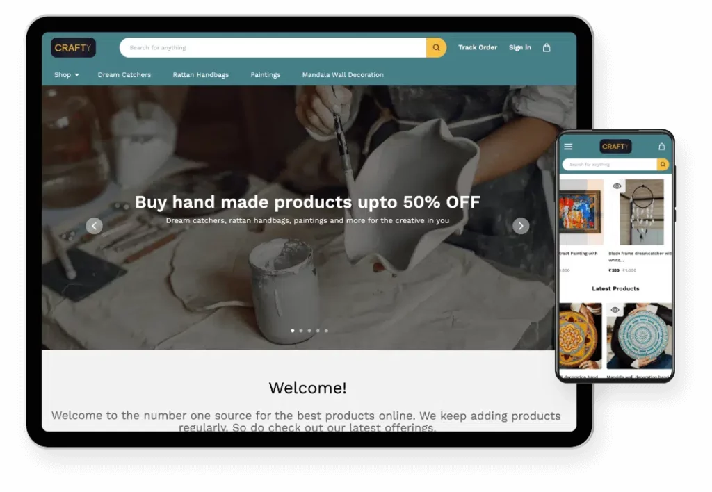
Optimise for mobile view
More than 70% of consumers shop online from their mobile phones. if your eCommerce website is not optimised for mobile view, visitors will not bother struggling to finish their purchase.
Ensure that your eCommerce website is optimised for display on different types of mobile screens.
Have CTA’s in prominent locations
It is important to have the Call – To- Actions in prominent locations so that the consumer’s eye is drawn toward them. They should easily be able to identify the button and also click on it.
Bad colours, too much information, and obscure position reduces your online store’s conversion rates.
Don’t ❌
Clutter
A clean and minimal display is crucial so that consumers don’t feel overwhelmed. They should have a clear idea of where to go for their requirements.
Too many things around the CTA, or too many different types of insignificant categories, and products will just confuse the website visitor.
Call-to-actions that are surrounded by more negative space and less clutter increase a company’s conversion rate by 232%. (VWO)
Forget colours can influence decisions
Colours play an important role in influencing decisions. When deciding brand colours, also be mindful of what kind of emotion you would want your brand to incite in the consumer.
Do you want them to feel calm? Go for blue, do you want an energetic vibe – go for purple or red! The choices are endless.
Related read: A guide on using colour psychology for your online store
Underestimate website speed and responsiveness
In this fast-paced world with a million options for consumers, there is no mercy for slow responses. You need to ensure your website is optimised for speed.
Do regular checks, and try seeing which elements are dragging you down – it might be the images, plugins or cache!
40% of consumers will wait no more than three seconds before abandoning a site (Akamai)
Do ✅
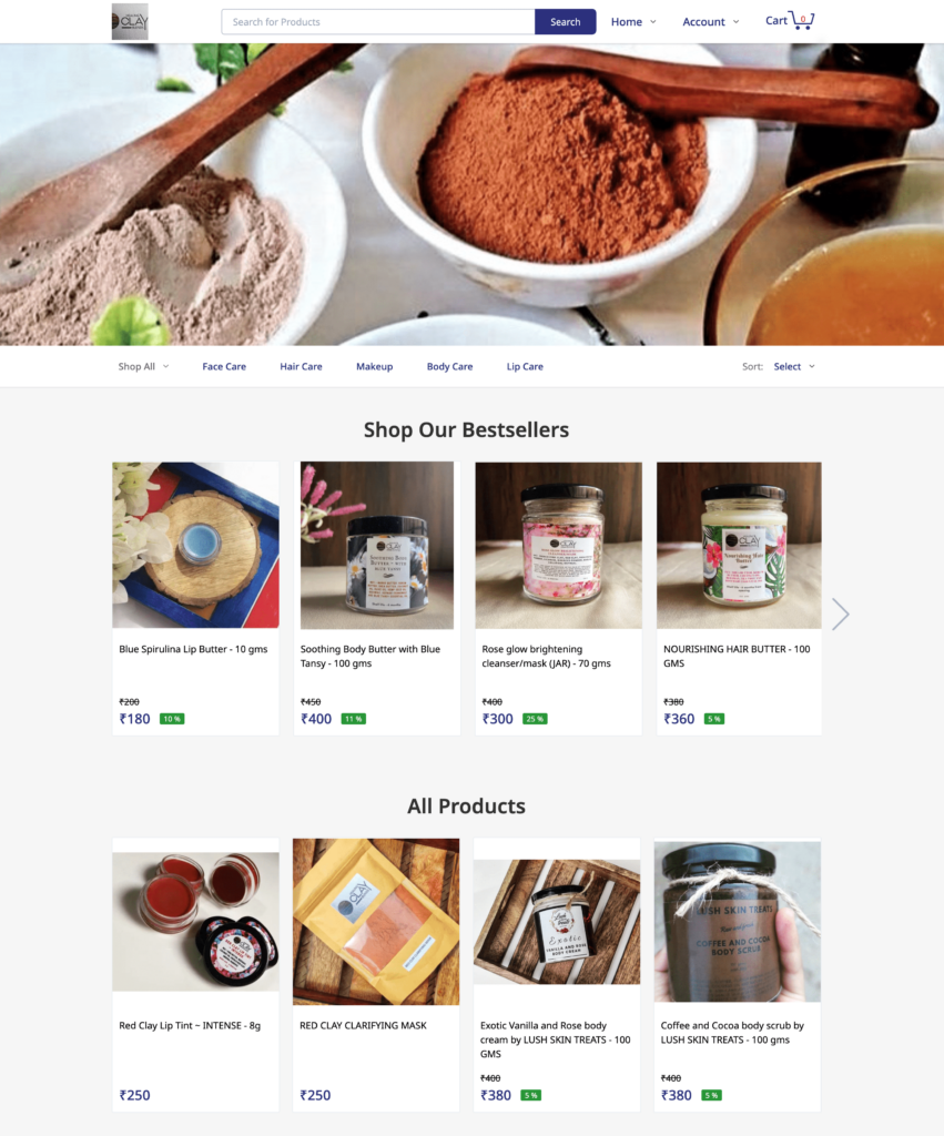
Have a featured products list on your eCommerce website
The customer shouldn’t have to keep looking for products. The more things they see, the more they are confused.
If you have a featured or a best-seller section, the consumer automatically knows that other consumers are also buying it. This positive social proof helps the consumer make faster purchasing decisions.
Keep it simple and easy
As mentioned earlier, DO NOT CONFUSE THE VISITOR. You have an extremely short amount of time to make a good impression. it is crucial that your website navigation is simple, intuitive and easy to understand.
A consumer decides to stay or leave on your website within 10 seconds (nngroup)
Have adequate categorization and product pages
If the consumer is on your eCommerce website because of a specific requirement, it helps the consumer if there are easy directions to go to that product.
Having product categories and proper page menus can help the consumer find what they are looking for faster, hence increasing your conversion rates.
Conduct regular hygiene checks (Grammar, typos, errors)
You might have uploaded a product months ago, but did you revisit it to see if the description still fits? Do regular hygiene checks of your website to identify areas where it can be improved.
Whether it is the text that can be made better or categories that can be refined – you should consistently keep updating your eCommerce website.
Ensure easy visibility of reviews and FAQs
Reviews and FAQs help the customer know things abt the product that you couldn’t put in the description. Always ensure the customer can easily see the review section so that it helps them make a purchase decision quicker.
The FAQ section can help the customer with self-service so that they don’t have to waste time waiting for customer support.
95% of shoppers read online reviews before making a purchase (Spiegel Research Center)
Related read: The Essential Ecommerce FAQs Guide For Small Businesses
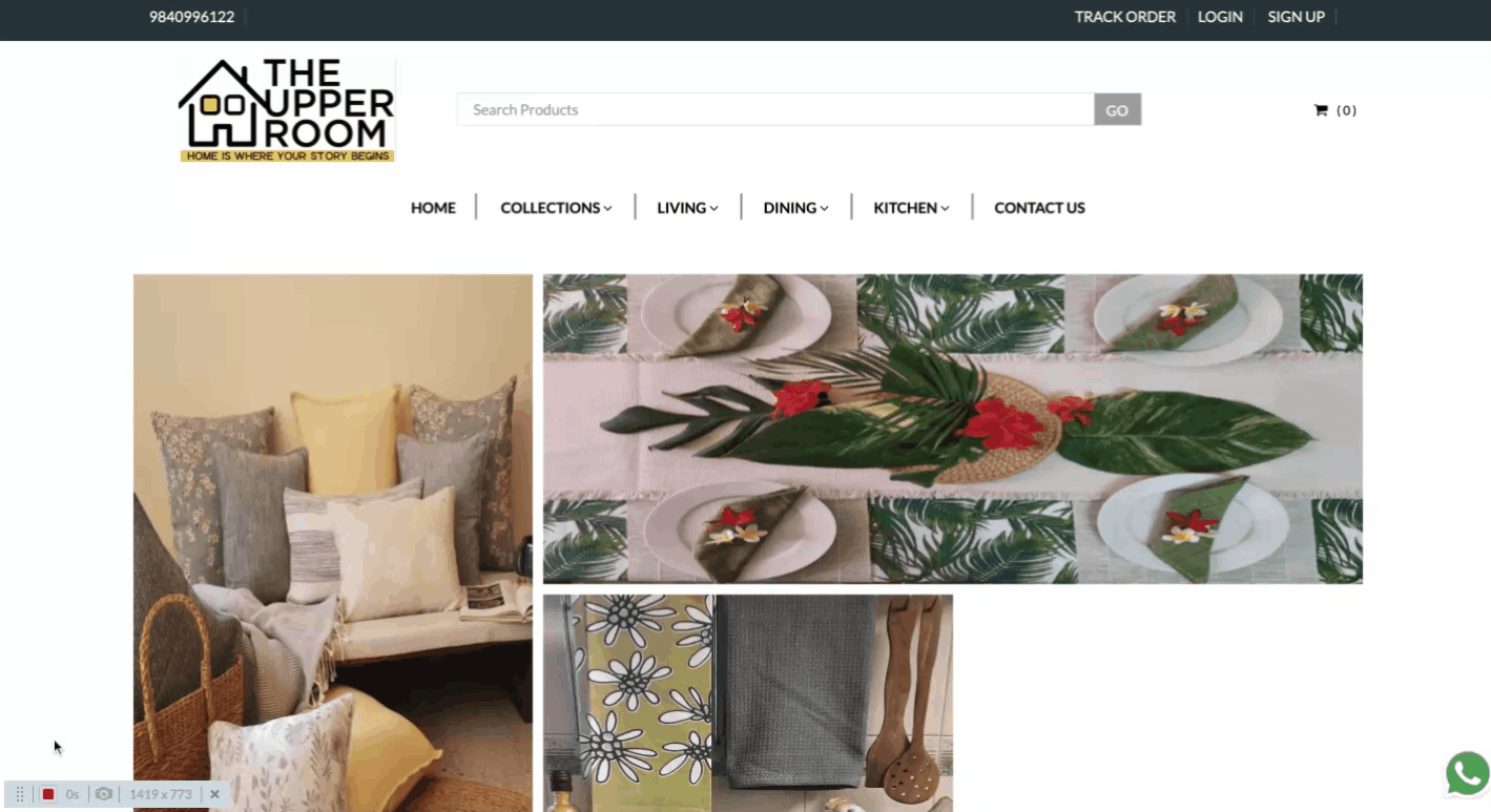
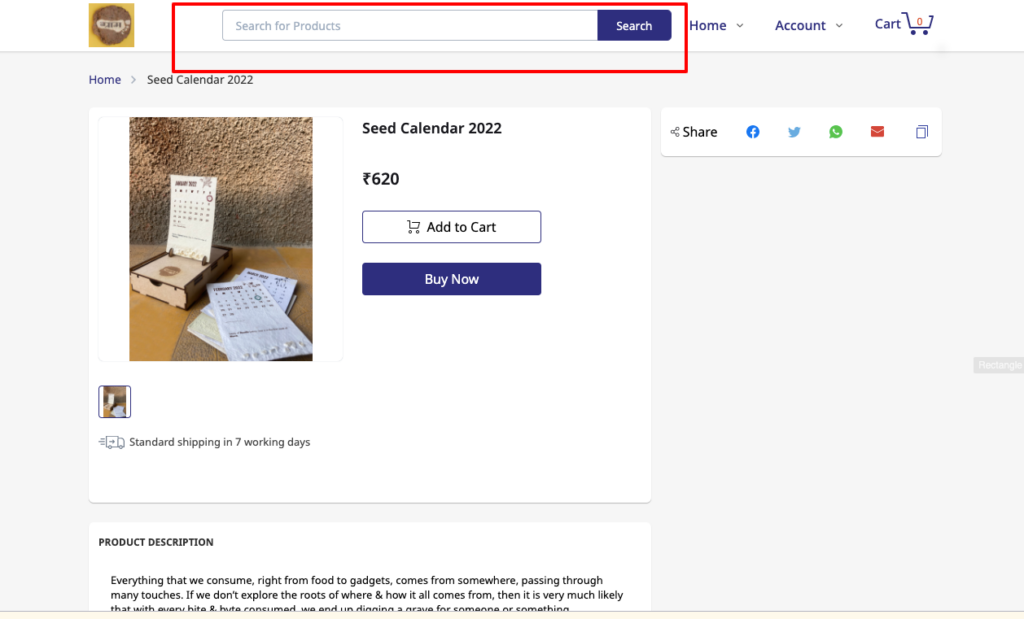
Have an easily visible search bar and link to the homepage
If a customer feels lost, they will just close the window. Avoid that by making it easier for the customer to navigate to wherever they want.
That means, having a functional search button clearly on display and also ensuring that they can go back to the homepage effortlessly if they want to do so.
Don’t ❌
Forget a detailed About section for your eCommerce website
A detailed About section basically tells the visitor what your eCommerce website sells online. But that’s not all, the About section also shows the consumer the values that you stand for, it tells them the vision that you have and the care you show towards your customers and teammates.
Related read: How to write About Us page for an eCommerce website (Tips + Examples)
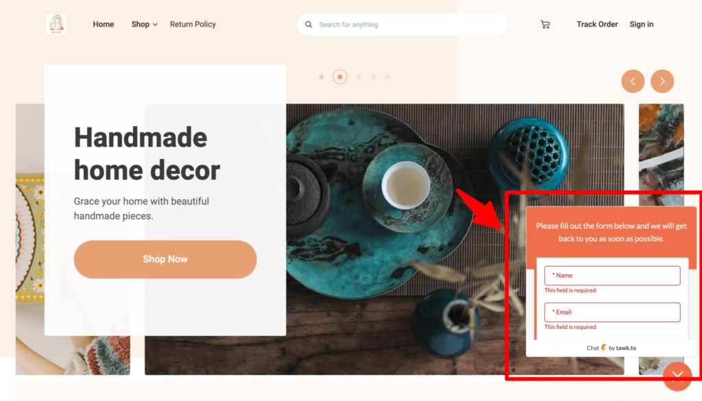
Have too many unnecessary pop-ups
Can you imagine going to browse a website, but then there are constant boxes that keep popping up? Avoid displeasing the consumer by being too interfering.
Try to limit the pop-ups, or have pop-ups in locations that do not hamper the browsing actions of the consumers.
Have too much information
Too much text is always a no-no. A consumer wants direct, clear direction. Do not crowd the website with too much information. Only put what the consumer really would need to know before they take their next step.
On the homepage, it is good practice to limit the text and images to what your core selling points are, what your best selling products are and testimonials.
84.6% of web designers think a crowded web design is a common mistake (GoodFirms, 2021)
Irrelevant product recommendations
Product combos are a great idea for increasing purchases. Personalising the product recommendations to the consumer is a great way of reducing the number of clicks that a consumer has to perform before purchasing something.
Irrelevant product recommendations can be a turn-off. It comes off as forceful and too promotional in nature.
Make account creation compulsory
Lead generation is an important part of a business. But with so many DTC brands now in operation, it can become bothersome for consumers to put in their personal details for every brand.
Sign up for our weekly newsletter for more such business tips and advice that can help you take your business from zero to 100! Subscribe here for free.
Do’s and Don’ts of the product images and description on your eCommerce website
Do ✅
Provide all necessary information
Your product description is important for the customer to understand exactly what they are buying, In a brick and mortar store, it is easy for the customer to physically understand what the product is going to be like.
In an online store, you have to paint a picture with your words. The description should give all necessary information like size dimensions special care instructions etc.
87% of consumers base their purchasing decision on correct product description (Salsify)
Related read: How to Write an Informative Product Description for Selling Online
Use high-quality images
Pictures are extremely important when you want to sell online, Unless the picture shows the product exactly how it will look the customer is always going o be uncertain about at they are spending money on.
There are multiple hacks for eCommerce product photography that you can use to ensure high-quality professional product images.

Highlight testimonial videos
More than images, videos work even better in showing the customer what the product looks like or the use cases of the product, you can put up videos, or ask your customers to put up testimonial videos of the product to increase trust.
Utilise SEO
Knowing what words the consumer will search for is important when you write your website copy or product description. This helps in search engine optimization (SEO) and your online store shows up higher in search rankings on Google.
Unless your website and product descriptions are SEO optimized, consumers who LOOK for you will still not be able to find you.
Don’t ❌
Use blurry low quality images
Using blurry low quality images can drastically affect your sales. Consumers do not want to buy a product that looks bad in pictures. The pictures need to be of high quality.
Blurry photos show disinterest and a lack of effort by the seller
Withhold shipping and return policy detail
Have clear shipping and return policies on your eCommerce website. Most consumers do not purchase a product if they do not know its return policy. Offering free shipping can also influence purchasing decisions positively.
92% of customers will become repeat purchasers if the return policy is simple
Related read: This whitepaper does a deep-dive on the state of trust in eCommerce
Oversell a product
Exaggerating product details can harm customer trust. Never oversell or add characteristics to a product that are not true. Provide genuine descriptions that match the product specifications.
Do’s and Don’ts of the customer support
Do ✅
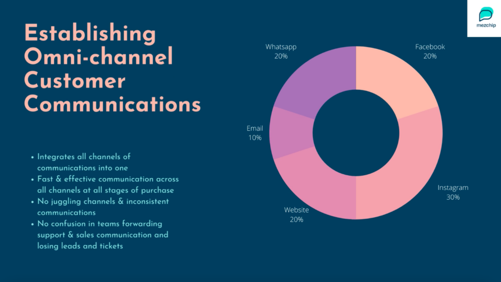
Be present where your customers are
Understand the behaviour and preferences of your target audience. Know where they like to hang out and be resent there. Do not expect them to communicate with you over a channel that they never usually use. Provide the different communication details on your website.
Improve your conversation rate by 8% with personalised customer experiences. (Zendesk)
Have a well-structured FAQ section
Young consumers today prefer self-service over long chats with customer executives. Having clear Frequently Asked Questions (FAQ) can help the customer solve their issues and concerns in minimal time.
Gather questions that most consumers have asked you before and then answer them briefly in the FAQ section.
Leverage automated self-service
Utilise automated tools that help accelerate customer service. You can use automated chats, also known as canned responses, that guide the consumers through a pre-decided structure of questions and answers to help them find what they are looking for.
Related read: Treating the king right – A customer experience handbook for eCommerce businesses
Use the live chat tool
Customers often want instant responses. The longer they have to wait, the higher chances are of them bouncing. Having a live chat option where they can directly talk to you/or a member of your team if they have concerns can help the customer feel appreciated and wanted.
Brand loyalty is a result of good customer service for 95% of customers. (Microsoft)
Don’t ❌
Restrict the customer to a single communication channel
If a customer wants to talk to you, they should be able to communicate on the channel of THEIR choice. So try being present on all the platforms where your customers are also present.
Keep the customers waiting for more than 24 hours
The internet has made the need for immediate gratification a real thing. To survive the intense eCommerce competition out there, you need to make sure, you do not keep your potential customers waiting.
Use chatbots to engage to keep your customers engaged.
90% of customers want an “immediate” response (HubSpot research)
Have them bounce from team to team
Remember, the customer is the king. That means, that if the customer is bounced from one team to the other, they will feel irritated and might drop off from your website.
The only way to make your customer happy is to also have happy and INFORMED employees. Your company culture can decide how effective the employees are.
Each team member should know the product, the brand values and the vision. This also ensures that the customer gets the correct information as soon as possible.
Keep contact details in an obscure place
Seller information is a key element for your eCommerce website. That way the buyer is more assured about making online payments, buying from you or recommending you.
Have different ways of contacting you clearly mentioned and place it in places that a customer will expect it. Do not make them hunt for it!
Links to your social media accounts, phone number, email ID, and an informative About Section – all of these need to be clearly visible on your eCommerce website.
Do’s and Don’t of the checkout process of your eCommerce website
Do ✅
Offer guest checkout
Even though account creation should definitely be an element for return consumers., also have an option for guest checkout. if they like your product they can always come back and make an account.
23% of consumers leave if forced to create an account (Neil Patel)
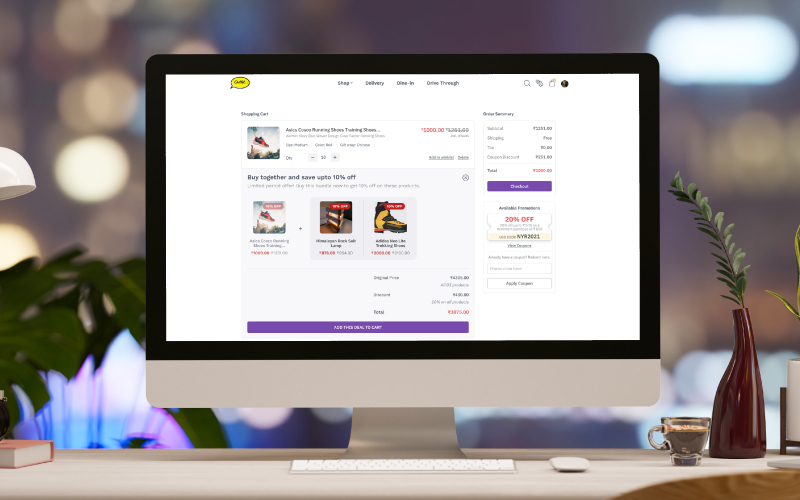
Provide cart summary
Consumers should be able to see what products they have selected for purchase. Not only that, but they would also want to see what their final charges are amounting to. Have a cart summary ready so that the consumer does feel blindsided.
In fact, you should also add the option to go back so that they can keep adding to the cart if they want.
Have saved address and payment options
Speed is your friend! With saved addresses and payment details, you are sparing the consumer the trouble of inputting these details again. Faster the checkout process, the higher the chances of them completing the purchase.
Don’t ❌
Have hidden charges
Hidden charges are extremely troublesome. If a person has chosen a product based on the price displayed, seeing the hidden charges may discourage them from buying it.
Always be transparent about all the charges that your consumer is required to pay from the beginning to the checkout process.
Neglect the security of the checkout page
Your website should be safe and secure. It should be compliant with the Payment Card Industry Data Security Standards (PCI-DSS) so that your transactions and card details are safe
The Instamojo payment gateway is not only PCI-DSS compliant but it also allows you to share quick payment links with your customers over different communication channels.
Have too many CTAs that can distract the customer from completing the purchase
The consumer may get easily distracted if there are too many calls to action in the checkout process. The checkout process should be smooth, fast and efficient.
This means as soon as the cart is ready, they should be able to quickly complete their purchase without being redirected to other websites or being asked to do different irrelevant actions.
With a premium store on Instamojo, you can experiment with 30+ themes for the perfect fit for your products! Create an online store for free and then upgrade at just ₹10/ day!