In the past, a simple computer would need an entire room. Today, you can wear 100 times that power on your wrist. Thanks to technology and the disruption it brings, computers have evolved from enterprise undertakings to consumer products.
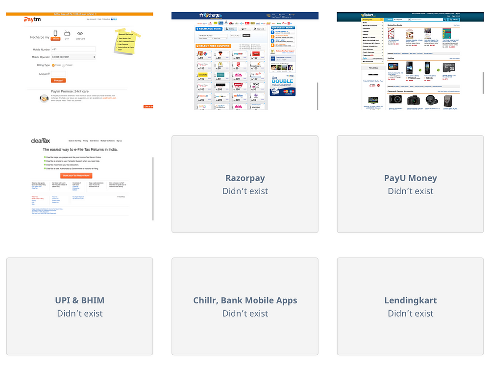
Back in 2012, when Instamojo started, online payments & e-commerce infrastructure were still enterprise services/departments. They were beyond the financial and technical reach of micro, small, and medium-sized businesses.
If you wanted to get an online payment gateway, you’d need to negotiate with the banks & gateways. You would need a team of engineers to integrate with terrible APIs. None of them would even talk to you unless you commit to lakhs worth of transactions a month. Only big companies could afford to give their customers an option to pay online.
There were no wallets, no Digital India, and our government wasn’t launching a new payments app every month. Most businesses relied on cash & cheques. NEFT was a city-folk thing. Even PayTM was a mere recharge website.
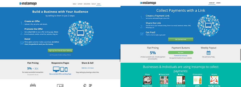
Instamojo started with an aim to simplify payments and e-commerce. We wanted to make payments as simple as sharing a link.
Upload your file, put a price, and you will get a link. Put that link in your email, blog, SMS, practically anywhere. Your customers can click & pay. You’d get the money directly in your bank account. It was that simple! There was no paperwork involved anywhere in the process.
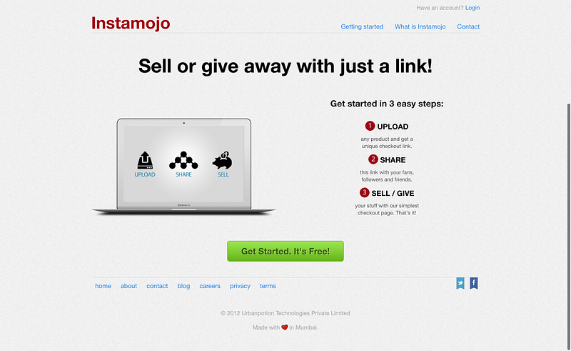
At that point, people compared our product to Gumroad & PayPal. We admired both. Gumroad did the same thing — sell digital files. PayPal was the king of online payments back in the day.
But over the years we learned, what works for the western audiences doesn’t necessarily work for the Indian audience. The demographic, abilities, tech, language, mental models, regulations — everything changes.
We gradually expanded beyond payments for digital files and now we manage more than just payments for over 300k businesses (at the time of writing). Each day our customers teach us how to make our product and business better. While most learnings are domain specific; some had a big impact, three stand out the most:
- Language & Mental Models
- Structuring the product to keep it lean, and future safe.
- Usability vs. Aesthetics, priorities for a young startup.
Mind Your Language
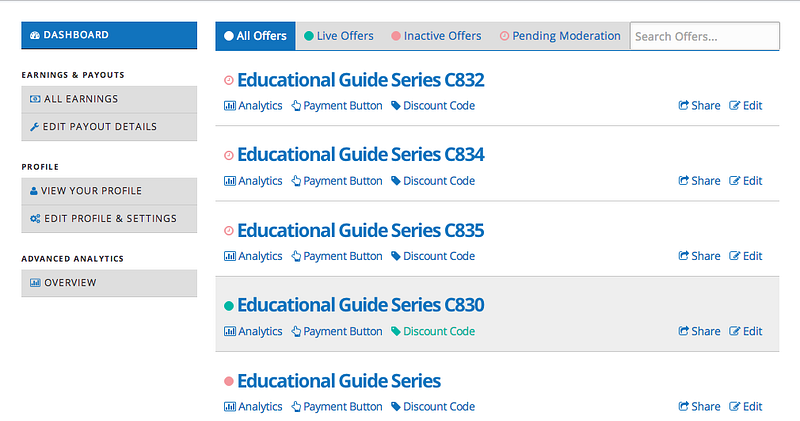
In early versions of the product, you’d create an ‘Offer’ to sell on Instamojo. The Offer could be a digital file, event ticket, or a service. You’d get a link for your offer to share with your customers. Your customers could pay with their cards or net-banking.
We were careless with words, but our early adopters were forgiving. Most were looking for a solution like Instamojo desperately and were happy that we existed. But we hit a ceiling when we tried to reach beyond the tech-savvy audience and grow our user base to beyond 20,000 merchants.
For some we worked out fine, but a lot of people were expecting us to bring them customers. They were comparing us to Amazon & Flipkart. We weren’t that. We made several attempts to fix our ‘pitch’ — “Your customers”, “turn your audience to customers”, etc. Nothing changed.
After talking to several existing & potential customers, we realized:
- People who were using us said that they were using Instamojo to ‘collect payments’.
- People who mistook us for a marketplace like Amazon or Flipkart. They were unhappy that we were not bringing them ‘sales’ and not ‘selling’ their products.
“Sell” & “Payment” have different meanings. Words are important.
You’re not going to be present in-person to explain what your product does; words do it for you. From landing pages to forms & buttons, words tell the user what’s going on. Words tell the user what the product is about and what it can do.
Words tell the user what the product is about and what it can do.
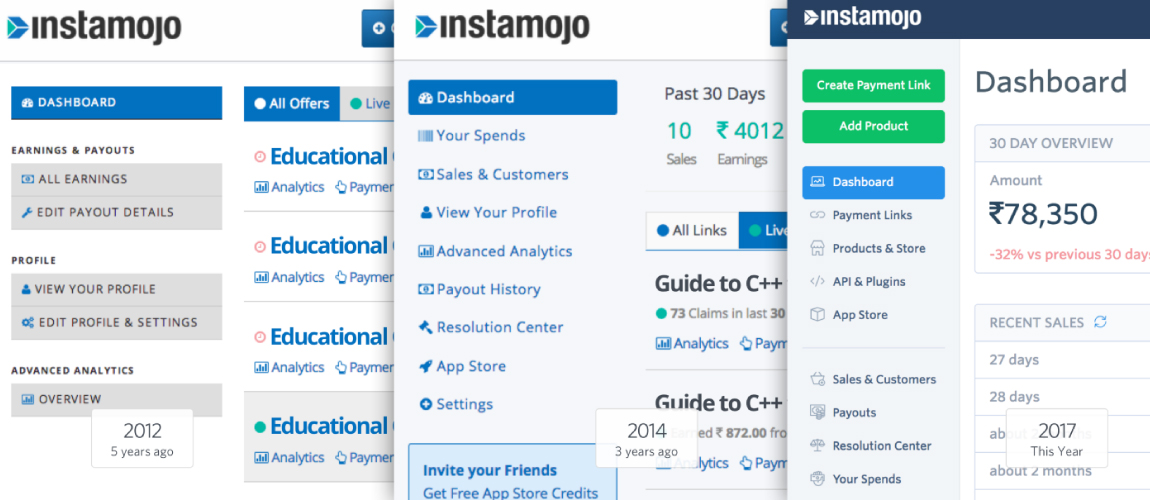
Our iterations with functional copy worked the best. After several iterations over the months, this is what Instamojo looked like:
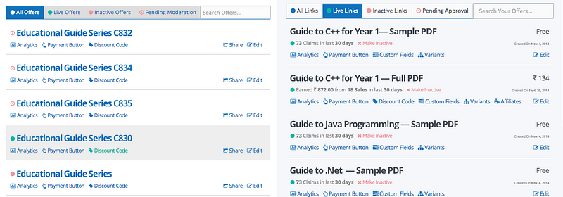
Offers became ‘Payment Links’. You create & share ‘Payment Links’ to collect payments. Simple! Yet took us over 20,000 customers and 2 years to reach here.
This was a small change in the product and a big paradigm shift that altered our customers’ experience. How do we know? We never again had to explain why we were not bringing them sales and why there wasn’t a ‘Search’ option on Instamojo. No one asked anymore.
It changed how we pitched our product, and what people expected of it. Today, our customers teach us how Payment Links can be used. 🙏 ❤️
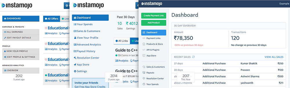
Another lesson on the importance of words & language came after we made a small addition to our dashboard. We added a unit to display aggregate sales and transaction numbers with the title ‘Last 30 days’.

We deployed the change at night, next morning there was a barrage of customer emails and calls asking if we were shutting down Instamojo or their account with Instamojo. 😱
“Why last 30 days?! What happened?”
‘Last 30 days’. Last has a lot of meanings and the customer is always right.
A small change deployed under a minute made the problem go away. We changed it to ‘Past 30 days’, the confused emails and phone calls stopped. Words are design.

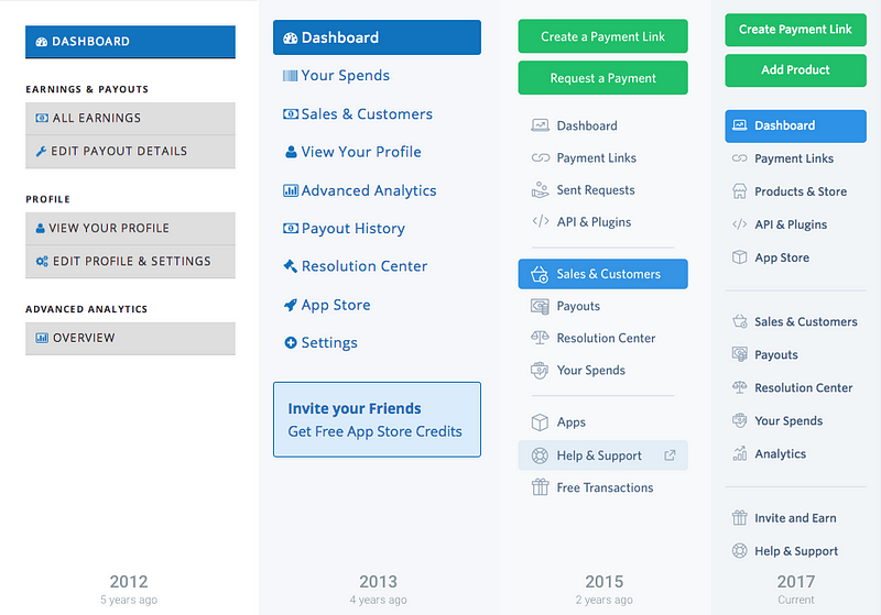
Rest two are choices that, in retrospect, worked well for the product. You’d notice that the earlier versions of Instamojo looked right out of Web 1.0 world. It looks empty and unpolished as compared to how it looks now:
It’s was a conscious choice to keep it empty & looking the way it did.
The choices weren’t based on what looked good or what was trendy. They were based on priorities, costs, and resources at hand. It helped us ship & evolve fast, and maintain the product with low time & effort.
Structuring the Product
There’s often a temptation to fill up your new product to make it look more ‘mature’ and avoid the ‘emptiness’. You try to fill up the empty space with features and complexity that your product doesn’t even need.
Most of the decisions at this point are made on big assumptions with almost no data. Every item in navigation, every “segment” or “vertical” a product has is a decision that brings, even more, decisions with it.
Keep it so simple that you’re almost ashamed.
Products are like trees. They don’t grow in a day or a year. They are constantly evolving to respond to their environment & interactions. If you fluff-it up today, there won’t be any room left when the real growth comes.
You will have a lot of paradigm shifts as you design your product, layer-by-layer, over the years. Keep a lot of room for errors. It’s easier to iterate and completely change a simple product. This emptiness is your margin-of-safety, the more the better.
During 5 years of evolving our product, we’ve had no problems adding more verticals to our product. The product is still evolving today without any notable issues in this regard.
Usability & Aesthetics
When I joined Instamojo, I was the first designer. And the in-house front-end person. For about 2 years I was designing & coding-up the product with Django templates (they’re horrible), javascript, and CSS.
I had 2 big priorities:
- Design a product that makes sense to the user.
- Make a product that works & ship it fast.
For a designer, its very tempting to make it look like a million dollar product. It’s tempting to apply everything you’ve ever learned. After all, this is what you wanted! To build a product from scratch and do it right. Functional and beautiful like no one has seen & done before.
But soon you will realize that you’ve taken on a mammoth task. Just to make sure that it makes sense and is functional takes a lot of work. There are endless layers of details that you will miss out and add over time. The requirements & scope of the product will change every other day.
Making it obvious is the goal. Obvious is hard. Sticking to usability principles is the only way to guarantee that your interface is obvious to most people.
In most cases, it means sticking to the medium’s default design choices — be it web, android, or iOS. Sure you won’t trend on dribbble, but your product will be used. That’s everything.
Having simple UI & interaction patterns helps keep the codebase small & maintainable.
This means speed, which is an advantage your startup should not lose. Plus, your product developers will love you for that.
For some products, however, aesthetics are a need; not a luxury. Especially vitamin products. But for a pain-killer product like Instamojo, usability was way above the priority list.
It was more productive to invest time & effort improving language, understanding mental models, and information architect; than investing it in aesthetics.
There will come a time when that will change. Aesthetics, visuals, interactions do become important as you try to establish a brand and appeal to a larger audience.
At about 1 Lakh customers, we started investing in those aspects of product & design. At that scale, we left our early adopter phase way behind and were reaching to merchants who were bringing their businesses online for the first time. Including a majority of non-tech savvy customers, who behaved more like consumers. (Therefore expected a customer product).
We upgraded visual & interaction patterns of the product to take it closer to a consumer product than a developer MVP and redesigned our mobile experience. Doing that while staying true to the usability principles is difficult, but we had Hardik who did an awesome job.
At the same time, we invested more in understanding our customers. Several people including Apoorv, Namrata, Dalan, and our customer facing teams spent time talking to our customers, testing out prototypes, and improving our product to a point where it could serve double the customer base.
During customer interviews and field visits, customers emphasized our product and services were ‘easy’ to start with and use. That’s where our claim to be India’s Easiest Way to Collect Payments Online came from.
This Post Was First Published on Medium.