In August this year (2018), we launched Instamojo’s new brand (along with a new line of products). As a part of the rebranding, we redesigned our products across the web and mobile platforms.
There were many questions to answer, like:
- How much should the design, interface, and experience change?
- How will it affect the business and experience of our existing customers? How much time will they spend retraining their staff?
- How long will it take to conceptualise, iterate, test, and deliver? How much time do we have?
- How many people would we need?
We had 45 days to get everything done.
When do we need a redesign?
Let’s talk about when a redesign is unavoidable.
First—if the business or product is pivoting. A fundamental shift in the nature of problems or target user mandates a redesign.
Second—when the design problems are costing the customer or the business. In most cases, both happen together and do damage before they get noticed.
The best approach, in both scenarios, is to start from scratch — the user. Anything else would increase the cost further.
Third—is rebranding—a shift in tone and identity of the business. It could be a complete overhaul including a name change. Or a refinement of the original brand.
In the first case, when the brand is changing completely, it may require the design team to delve deeper and rethink all the mental models from scratch. As a result, everything could change—the structure, language, tone, interface, visuals, etc. The scope for such a redesign exercise depends on why the redesign was done in the first place.
But in the second case, when you’re refining a brand that already works, an iterative evolution of design is a better approach. This helps preserve the nuances and learnings from past.
Here, “realign” is a better term than “redesign”.
That was the case with Instamojo. We were building on top of our existing brand. We were amplifying what worked, our “Design for India” approach, and realigning our messaging to what mattered most to our customers.
How deep did we need to go to redesign?
Our customers’ needs were the most important. Instamojo is used by lakhs of businesses who have a staff of 100s and 1000s — all of whom have learned Instamojo workflows and depend on them every day to get their job done. If we changed one button, several businesses would stop functioning.
This is why you don’t see a radical redesign in products built for work or enterprise. Even if they do go through a major redesign, they are always versioned to prevent the shock of switching costs.
You can redesign, for example, Twitter without such concerns. Sure, your users and marketing departments might hate you for a bit. But no one’s life would change dramatically. (WhatsApp is the opposite).
Bad redesigns can even kill a vitamin app, especially when users hate it. It’s most likely because you were thinking of your needs more than your users’.
We were redesigning Instamojo in two phases:
- Rebranding: To be launched with mojoCon and our new brand (this was to be done within 45 days)
- Long-term redesign for scale: Iterative improvements in the product, design, and experience to make the product more scalable
Rebranding
Rebranding the public facing Instamojo properties was the first priority. While the marketing and the communications design teams started working on the language, tone and messaging of Instamojo, the product design team was iterating to realigning our design system to the new brand aesthetics.
While our design system, grown over the past 4 years, deserves a full post; our component library was changing the most. It has several layers:
- Brand — basic brand identity and usually the first order derivatives (UI colours, type scales, etc.)
- Base (Elements) — Divs, type usage, shapes, the basic indivisible visual units of the interface
- Objects — Units which are made up of several elements. Eg: Buttons, Fields, Cards, Tables, etc.
- Components — Reusable interface models that have a lifecycle and several states. Eg: Cards, Menus / Navigations, Tabs, etc.
- Templates & Flows — a full structure/layout that is made up of several components.
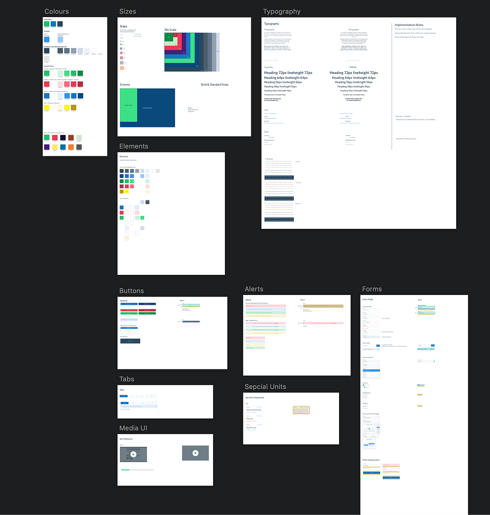
We have another component library for our public facing landing pages that was rebranded in parallel. Design systems not only help us improve the quality but also deliver faster.
A living design system helps you:
- Estimate & prioritise the work and scope
- Covers the risk of missing something critical
- Preserve knowledge
In fact, every progressive iteration gives you a chance to fix past mistakes.
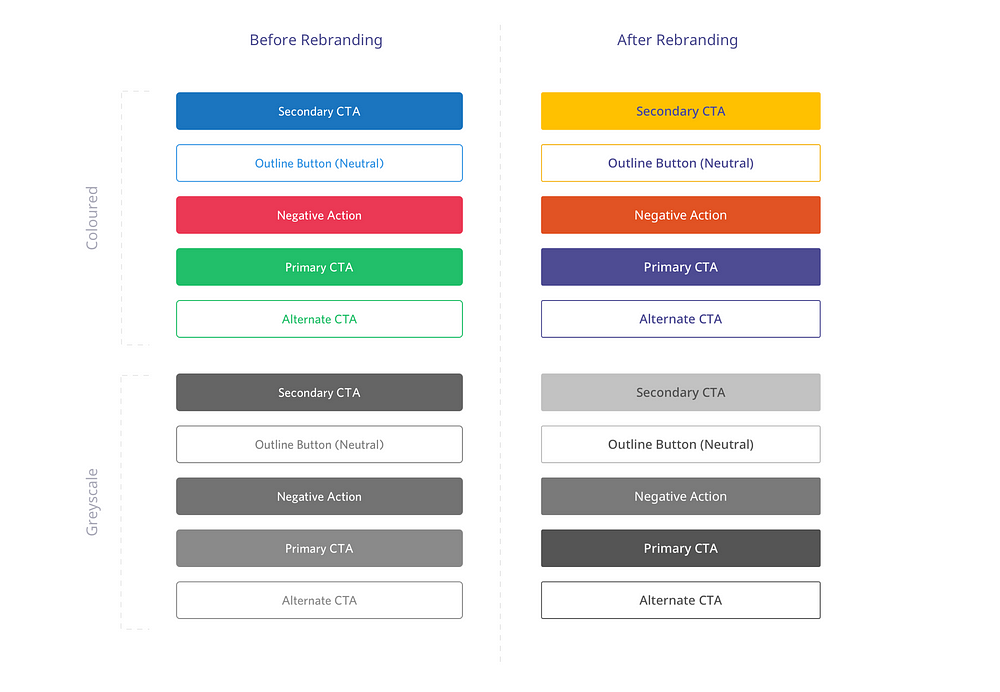
For example, this was our earlier colour palette: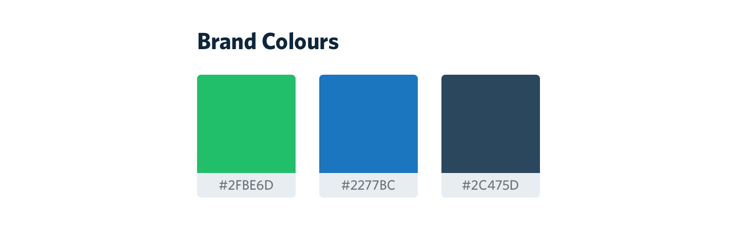
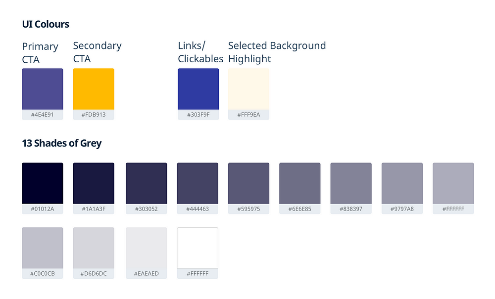
And this is our new palette:
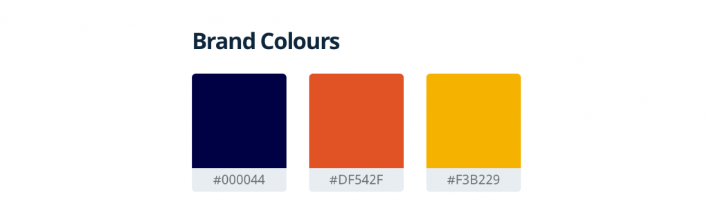
And here is the palette we derived from our brand colours:
As discussed earlier, our primary concern was minimising re-learning for our existing customers. What is it that our users hard learned? What would they need to relearn?
Procedural Memory
Our learning, especially the user-interface learning, heavily relies on muscle-memory (a type of procedural memory). This is the same sort of memory we rely on to accomplish things like touch typing, cycling, etc.
There are two relevant parts for our discussion on understanding memory and learning:
- Spatial Memory: Simply put, spatial memory helps you recall where things are. This is also how you remember what switch is for what purpose in your house.
- Visual Memory: How things look — relative contrast, size, shape, etc. This is how we learn to read the script of a language and get better at it.
Since we were not changing the basic structure and architecture of the products, that took care of the spatial memory.
For visual memory, we focused on the relative contrast of visual components. Either retaining or improving their relative contrast.
For example, our buttons for positive, negative, and neutral actions had different contrasts. We improved the relative contrast between the buttons while translating them into our new design system.
Moving up the layers, executing and testing all along the way, we accomplished the redesign in 45 days 🔥


We were a team of 5 including–3 designers (Animesh, Mj, and Sreenath Kotteri), 1 engineer (Priya Choudhary) and, I. Plus we received all the support we could ask for from the mojo family.
Long-term redesign for scale
While designing is a constant exercise, there is design debt to be paid. Simple law of numbers — when the user-base increases rare use-cases become common. The design starts to feel stale and I don’t mean “it’s so 90s” stale. I mean “it’s too painful!” stale.
We took this opportunity to repay some of the design debt. We are redesigning the business-critical parts of the product in reverse order of usage. This ensures the least relearning for the user. It also gives us buffer to make mistakes as we move towards redesigning heavily used products and features.
We combine these releases with major product updates or new product/feature launch. The excitement and curiosity of a new product/feature can help with user inertia.
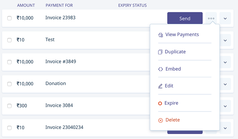
“How do I delete this?”
On Instamojo, a merchant can create a Payment Link they can share with their customers to accept payments. There’s a dashboard where the user can manage all their links. Untill earlier this year, we did not allow the users to delete their links. You could switch it off & on. But you couldn’t delete it.
While there were a lot of reasons for making this design decision, the most important ones were:
- We couldn’t delete records of something that was sold; it’s hard to refer to them, etc.
- A typical user wouldn’t have more than 100 links (that was true up until a year ago)
The second reason vanished as we grew multifold. Users had thousands of links. “How do I delete this” for some got so out of hand that they had to create multiple accounts with us just to escape their links 😞. This is a typical example of design debt and if not fixed in time can cost the business a lot.
We fixed this and several other problems during this redesign. We discovered critical problems by talking to the users (something Mohamed Ansari does the best) and going through months of support tickets.
Today, all payment links are deletable and editable. Something we wouldn’t be able to pull off if not for the resources and scale.
But the dashboard screenshot doesn’t begin to tell the story of the relief our users felt. Here’s how our users reacted by deleting payment links after we launched the feature:
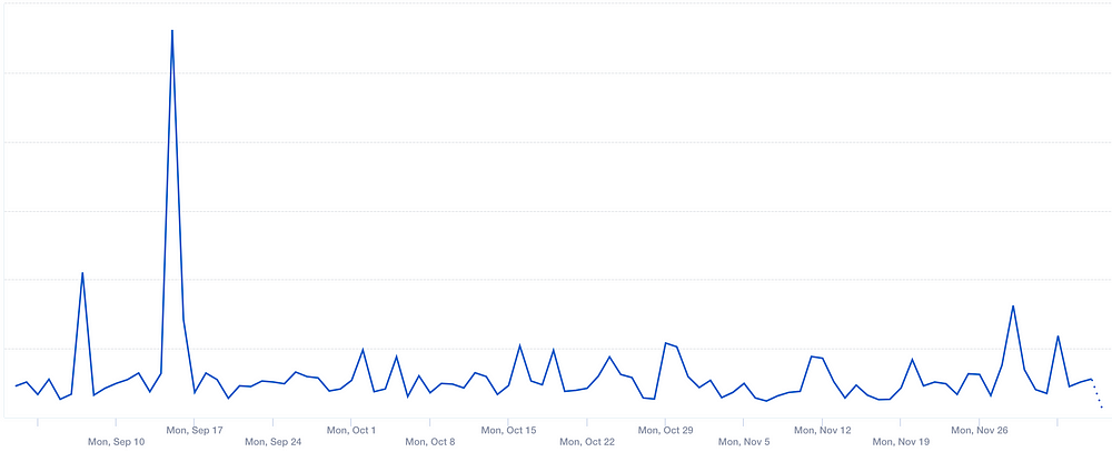
Now that’s a redesign users love!
We’ll continue to realign the product & design to our customers’ needs. For us, redesigning is a continuous process, something we do every day.
(This post first appeared on Sidharth’s Medium Blog.)
2 comments
A good post. We have been using Instamojo from past 6 months. Really happy with overall product, though documentation can be still improved.
We are redesigning our own website and partly its done.
Do you use any front end framework or planning to adept one like Material?
Its a very good platform to all those who provide our service to the world thnxx you instamojo ☺😊😍😍