The importance of data is growing as we continue to collect more data than ever. Understanding customer behaviour has become a priority for every business, regardless of its size. Let’s talk about data analytics for small businesses.
Taking direct customer feedback (via conversations or surveys) has always been a great way to collect business insights, but that can only go so far. Customer behaviour data can reveal several important things – who is your customer, where they are based out of, what they like and so on.
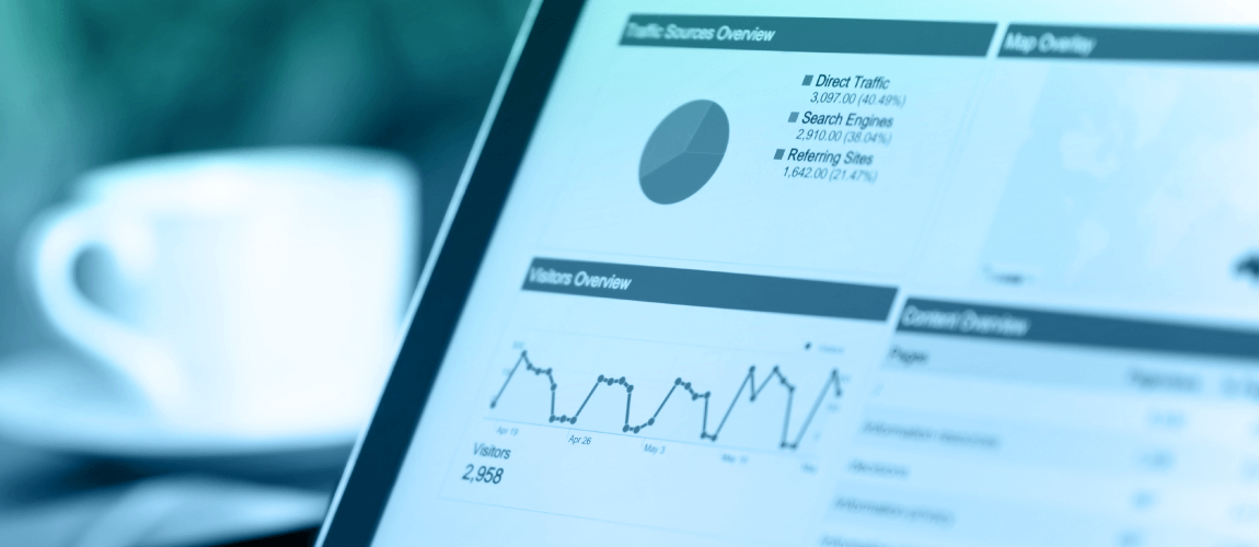
Instamojo has been empowering businesses of all sizes on its platform. We provide several features like online payments, invoicing, store, shopping cart — and the latest on the list are the “Analytics Dashboards” which allows a small business to get in-depth insights on their customer and their traits.
Let’s check out what Instamojo Analytics is all about!
There are six data dashboards that offer information you can use to track customer behavior:
Analytics Overview
What it shows:
An overview of your sales on Instamojo for different periods. You can also check the trends of average transaction size and daily sales/payment volumes.
Why it’s useful:
Allows you to get a quick overview of how your business has been doing and spot any dips, seasonalities, and good or bad patches over time. You can also get your sales numbers for quick accounting or other use cases, without downloading tedious excel sheets with transaction-level data.
Sales Break-Up and Payments Break-Up
What it shows:
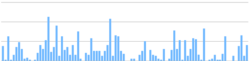
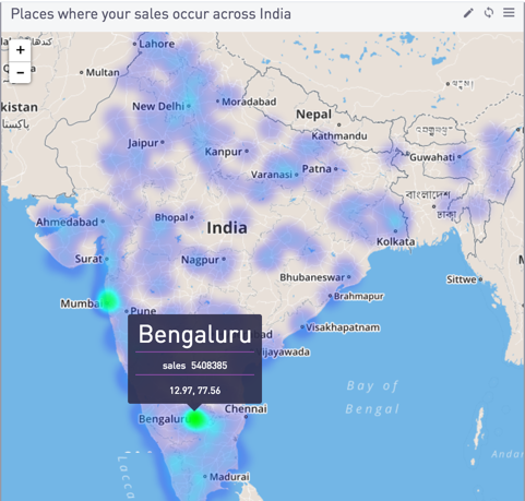
More information on where your customers are, what devices, browsers, and operating systems they are using. Also shows your sales by an hour of the day and day of the week.
Why it’s useful:
A better understanding of which devices/browsers you should optimize your blog/website for. To figure out which cities or states your customers are from, and which ones you could expand more to get more sales.
Hour-of-the-day and day-of-the-week trends can help you to fine-tune your email and social media marketing, as well as run discounts at the most opportune time. For example, if you see that sales are dimmer during Wednesday/Thursday (mid-week) for you, try offering a discount on those days. And if you see volumes are particularly high on weekends, Sunday might be a great day to send a custom email with the latest products to your base.
Visitors
What it shows:
How many people are visiting your links, product pages, and online store from what sources (Google/Facebook/Blog/Your Website, etc.)? What’s the visit-to-payment conversion rate on your links and product pages. Going deeper, which users tried to pay you (entered their name/email/phone details), but did not complete the payment.
Why it’s useful:
To understand what sources are bringing your users to your store/website/blog so that you can determine ROI on advertising channels by focusing on the more efficient channels. Helps you to find out your best-converting links and products. You can also send a reminder email (with an offer, if you’d like) to users who were interested but didn’t end up buying your product or service.
Retention
What it shows: How many people are buying from you .every month
Why it’s useful:
Mainly for businesses trying to get recurring customers, such as subscription businesses, or regular tutorial sellers. You can see how many of the people who bought from you once, came back again to buy more. This helps in understanding how many customers are churning fast enough and determines if you need to tweak your product, marketing and discounts accordingly.
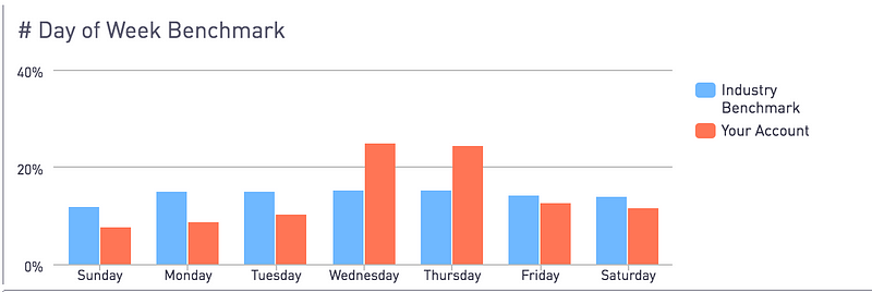
Compare to Benchmarks
What it shows:
Data of your customers, compared to the benchmarks of the small business industry, derived from proprietary sources.
Why it’s useful: To see how close or far you are from small business industry norms on various parameters. You can get insights into where you could do better, on which parameters your business is significantly different from the average industry trends.
For example, if you see that the number of people paying you from their mobile/smartphone is much lower than the industry normal, it may be a warning sign that means you should work on making your website mobile-friendly, as the average buyer is going mobile faster than you might have thought.
That’s not it!
You can filter all the dashboards by any date range that you would like (ranging from all time to last one day), and group relevant charts by days/weeks/months/quarters and years to understand trends in any way you’d prefer.
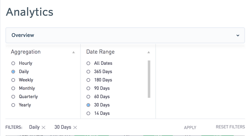
Available Filters on Dashboards
We hope you will love using this feature as much as we loved building it. It opens up endless possibilities to gain invaluable insights from your sales and payments data. This should help you grow your business by listening to your customers — even when they aren’t directly speaking to you.
This post was penned by Ankur Sharma, Head of Analytics and Digital Marketing at Instamojo.com
1 comment
This analytics will really help out for small business concerns. Thanks for sharing such great post