
Have you ever wondered what high-performing landing pages or eCommerce websites are doing right? Well, there are multiple individual elements that are working towards converting store traffic into customers. One of these elements is the Call to Action (CTA). Your store visitors will take decisions based on how good your CTAs are. These Call to Action examples will show you how online stores can use them to drive conversions.
In this post, we will be discussing what a “Call to Action” is, why your eCommerce website needs them and how to create CTAs that boost conversions.
What is an eCommerce Call to Action?
eCommerce Call to Action is a button or phrase that can be on a banner, landing page or content that convinces the visitor to take a particular action.
A CTA tells your store visitor what step they should be taking next. It guides where they click, and the virtual path they follow.
The most basic CTA that you have all seen is the “Buy Now” or “Add to cart” buttons. They tell you that if you click on these buttons, the specific actions of completing the purchase or adding the product to their shopping cart are going to take place.
Strategically placed CTAs with compelling and relevant text can catapult your online store conversions at minimum cost.
A CTA can be in the form of:
- A text that has been hyperlinked
- Buttons
- Plain text without links
- The texts can be accompanied by images if you want.
CTAs are not limited by the number of words or how you place them.
But, eCommerce businesses over the years have seen certain techniques and best practices that have seen a higher conversion rate.
Let’s look at some of these.
Best practices for effective eCommerce Call to Actions
Let’s imagine you’re strolling through a bustling online marketplace. What’s that one thing that nudges you from just browsing to clicking that “Buy Now” button? Call to Actions (CTAs) are the wizards behind this magic.
Get comfy as we venture into the world of eCommerce CTAs. We’ll uncover the secrets of crafting persuasive copy, playing with colours that tug heartstrings, nailing the perfect CTA spot, and ensuring your design wows on mobile too.
Create urgency
If the text on your CTA can create the fear of missing out or FOMO, there are higher chances of customers clicking. A sense of urgency tells the shopper that the opportunity is right now, it’s limited, and that they will be missing out.
Phrases like “Sale till midnight”, and “2 left in stock” are all designed to create a sense of urgency.
Use action words
The language on your CTA shouldn’t be vague or aimless. Even if you are providing the information that the customer needs, they still need to know what to do next.

The CTA guides them. Insert an action word so that the shopper has an idea of what is in store for them.
For example, saying “Buy now” is different from “Learn more”. It clearly defines two different forms of action. One is to complete a purchase, on the other hand, the other allows the shopper to know more.
You can find some powerful Call to Action phrases and examples here.
Focus on the design
The reason your store visitors will click on the CTA is if they can find it. A good design of the CTA is important so that it catches the attention of the viewer.
Unless the CTA is clearly visible with relevant text, the customer will not know what to do.
Even though there aren’t any clear-cut techniques that guarantee conversions, some practices are considered to have performed better than most.
For example:
The colour of the CTA button should be in contrast to its background.
The size of the text depends on the context. However, the most common CTA’ buttons have 2–6 words on them.
Related read: The Do’s and Don’ts for the perfect eCommerce website
Strategic placement
The CTA should have some white space around it to avoid blending into the rest of the text. The idea is that store visitors should be able to immediately locate it.
A good idea is to have hero images or banners that have the CTA.
The hero image can then link to the particular product. The hero image can be used to highlight a particular collection or best-selling products.
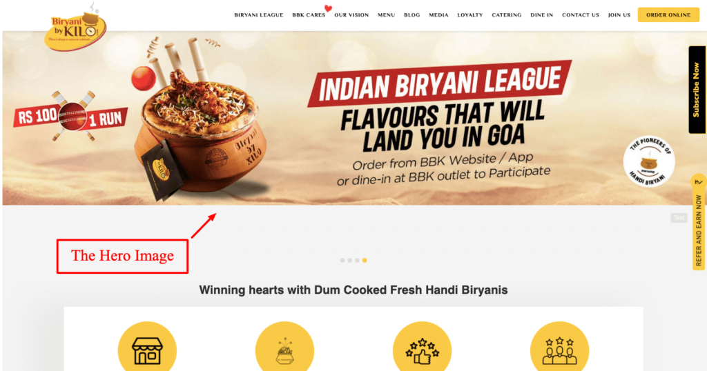
Another best practice is to always place the CTA “Above the fold”.
The “fold” refers to the part of the website that a visitor sees without scrolling down at all. Any content that is above this line is immediately visible to the store visitor.
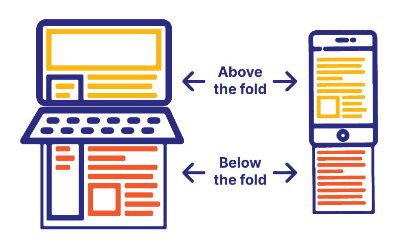
Placing a strong CTA there is super effective since it reduces the browsing time for a visitor. They are enticed to complete a purchase through the link placed in the image.
You need to know your target audience well to craft CTAs that persuade them to buy. Our eCommerce Trust Report 2022 contains some useful insights on what eCommerce consumers expect from brands. Get your free copy of the report today!
eCommerce Call to Action examples and why they work
Here are some Call to Action examples that you can draw insights from when designing CTAs for your own online store.
Trello
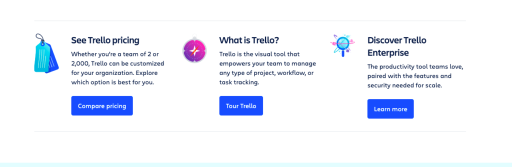
So, you drop by Trello’s page, and bam! Right there is the “Sign Up – It’s Free!” button, practically winking at you. They nailed the art of catching your eye with snazzy colors. And that “It’s Free!”? Feels like a friend inviting you to a party rather than just signing up.
Why does it work?
- CTAs tailored to respective landing page functions, like “Compare pricing” or “Tour Trello.”
- Ample space around buttons directs consumer clicks effectively.
- “It’s Free” gives an added incentive.
- “Start doing” CTA aligns uniquely with Trello’s core purpose.
Related read: 7 Work from home tools you need to boost your productivity
Nua
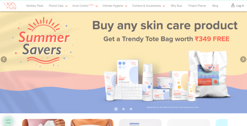
Now, let’s talk Nua skincare. You’re scrolling through their goodies, and oh, that “Add to Bag and Save 15%” button beckons. Urgency meets savings – quite the combo, right? And they get you, offering a “See Details” peek for the extra-cautious.
Why does it work?
- Vivid hero image colors match text, conveying a summery theme and intended action for Nua visitors.
- The text is to the point and has a clear value add.
- The word ‘Free’ is in red. A colour that again denotes urgency.
Related read: How to sell cosmetics online in India
Instamojo
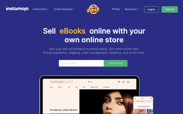
Guess who’s acing the CTA game? Instamojo! The bold “Start Selling on Instamojo” buttons aren’t just buttons; they’re like a friend saying, “Let’s make your dreams happen!”
Why does it work?
- “Get started” CTA stands out against the background, easy to find.
- Aligns with Instamojo’s promise of simplicity in online selling.
Rotating headline text creatively highlights the range of items sellers can vend with Instamojo, eCommerce website builder.
That art girl
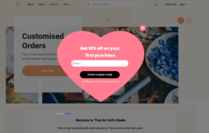

Now, imagine strolling through That Art Girl’s online store. You spot a dreamy watercolor set, and voila! There’s a CTA that whispers, “Unleash Your Inner Artist.” It’s not just about paint; it’s an invite to an artistic adventure.
Why does it work?
- That Art Girl employs a distinct and catchy pop-up CTA for “use the discount.”
- Hero image illustrates the outcome of clicking “shop more” – browsing swanky paintings collection.
This store has been created on Instamojo.
Kissmetrics

Ready to meet a CTA pro? Let’s talk Kissmetrics. They’ve got this data-driven CTA thing down to an art. Imagine visiting their site and bam! The “Get a Demo” and “Watch a Demo” buttons are right there, like they read your mind. It’s like having a helpful guide on your eCommerce journey.
Why does it work?
- Kissmetrics uses distinct CTAs for varied offerings, aiding swift content choice.
- Consumers save time and cut through clutter, selecting preferred content upfront.
Related read: Analytics on Instamojo online store: how to get started
Calm
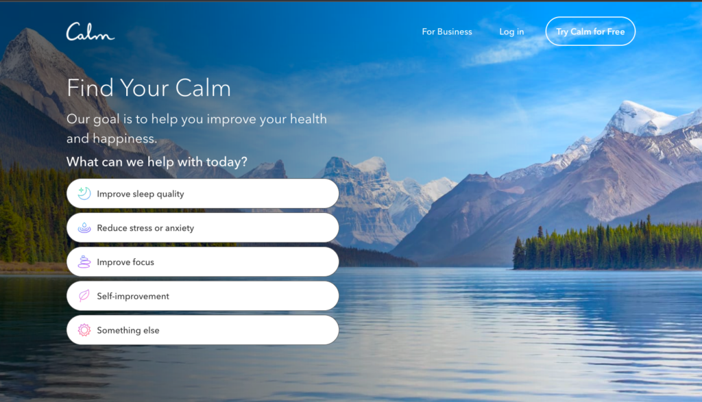
Now, shift gears to Calm – the masters of serene CTAs. You visit their site, and instead of flashy “Buy Now” buttons, you’re greeted with “Explore Calm” and “Join for Free.” It’s like a gentle invitation to a calming oasis.
Why does it work?
- Clear CTA on Calm’s homepage prompts finding “YOUR calm.” Tailored content offered based on chosen action.
- Background image is serene, enhancing focus on the text and brand’s message.
Bykudrat
Let’s talk Bykudrat. They’re all about eCommerce CTAs that speak the language of nature. Imagine clicking on their honey jar and being greeted by “Taste Pure Bliss.” It’s not just a button; it’s an invitation from nature itself.
Why does it work?
- Two CTAs, distinct colors, guide choice: “Add to cart” or “Buy now” for purchase.
- Continuing shopping? Top ByKudrat sellers shown, with clear CTA to return.
- Bonus: Social share links in view, enabling easy product sharing for brand exposure.
- This store has been created on Instamojo.
Related read: How to set up social media for small businesses: A complete guide
Sleepy Owl
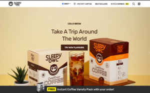

Now, onto Sleepy Owl. Scroll through their coffee line-up and finding CTAs like “Brew Me Up” or “Give Me a Sip!” It’s like their coffee is having a friendly chat with you.
Why does it work?
- CTA text is contextually relevant and engaging, driving user action on Sleepy Owl’s site.
- CTA text is concise, highlighting value addition and experience, not just the product.
- “Free” product offer is emphasized in yellow, grabbing attention of eCommerce shoppers.
Boat Lifestyle
They turn eCommerce into a journey, where every CTA – “Shop Now” or “Learn More” – is like a friend pointing the way. Whether it’s “Cut the Cords!” for wireless earbuds or “Add Color to Your Music” with vivid headphones, Boat Lifestyle’s CTAs aren’t just buttons; they’re your eCommerce adventure, just a click away.
Why does it work?
- Boat Lifestyle adopts a daring web design with black theme, a risk that has paid off. Amidst the black backdrop, the red CTA stands out prominently.
Call to Action examples social media
Ready to supercharge your social media game? Let’s have a look at Call-to-Action examples for social media. We’re sharing 5 killer CTAs that’ll have your audience shopping, learning, and joining in no time. Say goodbye to passive scrolling and hello to active engagement!
These CTAs are clear, concise, and encourage immediate action or engagement from your audience. Here are the 5 most important and impactful call-to-action examples for social media:
- Shop now!
- Learn more.
- Join us!
- Get started.
- Discover now
- See how.
- Sign up.
- Grab yours.
- Don’t miss out.
- Share your thoughts.
- Follow for updates.
- Get yours today.
- Click to learn.
- Subscribe now
Call to Action examples for sales
If you’re ready to amp up your game, you’re in for a treat. Here are some Call to Action marketing examples or for sales. Get set for a bunch of game-changing CTAs that’ll have your conversion rates skyrocketing. Turn those clicks into sales with these proven CTAs!
- Shop now and save!
- Limited time offer – grab yours today!
- Upgrade your online store now!
- Get 20% off before it’s gone!
- Claim your exclusive deal!
- Act fast – limited stock available.
- Unlock special pricing – click here!
- Don’t miss out on these savings.
- Start your eCommerce journey!
- Get started with a free trial!
- Book a demo and experience.
- Talk to our experts – schedule a call.
- See why Isntamojo is a game-changer!
- Join our satisfied customers – order now!
- Experience the difference – shop today!
Examples of Call to Action on websites
We’re about to open the vault to a collection of CTAs that are like magic spells for boosting engagement and conversions. Get set to learn how to craft compelling prompts that guide your visitors toward action. Let’s make your website an action-packed adventure!
- Start your free trial now!
- Shop our new arrivals!
- Get your exclusive discount today.
- Subscribe for updates and offers.
- Book your appointment online.
- Download your free ebook.
- Request a quote for your project.
- Learn more about our services.
- Join our community—sign up!
- Explore our blog for insights.
- Contact us for a consultation.
- Browse our product catalogue.
- Get a demo of our software.
- Register for our upcoming event.
- Chat with us for assistance.
Business Call to Action examples
Ready to turn clicks into clients? Here is a collection of CTAs that’ll turbocharge your conversions, from snagging leads to sealing deals. Let’s uncover the secret sauce behind crafting CTAs that keep your audience hooked and your business thriving!
- Request a quote for your project.
- Book a free consultation.
- Get started on your journey.
- Schedule a demo with us.
- Explore our product offerings.
- Sign up for our newsletter.
- Join our loyalty program.
- Shop our latest collection.
- Upgrade your subscription.
- Contact us for support.
- Claim your special offer.
- Learn more about our services.
- Download our white paper.
- Request a callback.
- Enrol in our online course.
Call to Action video example
Ready to turn viewers into super fans? We’re digging deep into the world of Call-to-action in videos. Get set to learn the art of crafting CTAs that’ll have your audience hitting subscribe, engaging like crazy, and spreading the word. Let’s roll up our sleeves and dive in!
- Don’t forget to hit that ‘Like’ button if you enjoyed this video!
- Subscribe to our channel for more [related content].
- Turn on the notification bell to stay updated with our latest uploads.
- Leave a comment below and let us know your thoughts!
- Share this video with your friends who might find it useful.
- Check out our playlist for more great content like this.
- If you want to learn more, click the link in the description.
- Follow us on social media for behind-the-scenes updates.
- Join our community by becoming a member for exclusive perks.
- Support us on Patreon to help us create more content.
- Watch our next video for [upcoming topic].
- Hit the ‘Share’ button to spread the knowledge!
- Tell us what you’d like to see in future videos.
- Give us a thumbs up if you’re excited for our upcoming series.
- Catch up on our previous videos while you wait for the next one!
Donation Call to Action examples
Whether it’s supporting a local community initiative, aiding disaster relief efforts, or championing a cause close to your heart, donating is a direct and meaningful way to effect change.
This introduction sets the stage to explore a spectrum of compelling donation call-to-action examples that inspire action, encourage empathy, and drive transformation.
- Make a difference today – donate now!
- Your support can change lives. Contribute today.
- Join us in our mission. Donate today!
- Every dollar counts. Give what you can.
- Help us create impact. Donate now!
- Be a hero. Support our cause with a donation.
- Empower change. Make a donation today.
- Give hope. Your donation matters.
- Donate to bring positive change.
- Ready to make an impact? Donate now.
- Support our work – donate and make a change.
- Help us achieve our goal. Donate today!
- Become a supporter. Donate to our cause.
- Give a little, change a lot. Donate now.
- Together, we can make a difference. Donate today!
Podcast Call to Action examples
Welcome to podcasting, where stories flourish. But wait, it’s not just about listening – it’s about engaging. We’re here to explore podcast Call to Action examples. These prompts? They’re like invitations to a conversation.
Subscribe, share, speak up – they turn listeners into active participants. Let’s discover how each Call to Action weaves connections, shaping our podcast into a dialogue that goes beyond audio. Get set to make your podcast truly interactive!
- Subscribe for weekly adventures
- Leave a review, spread the love
- Join the conversation
- Unlock exclusive content
- Share with a friend
- Get notified
- Participate in polls and surveys
- Nominate guests or topics
- Attend live recordings
- Learn more on our website
Having CTAs that are bright red, is a sure-shot way of grabbing the customer’s attention. Bright colours like red often scream urgency, regardless of the text in them.
Try some of these strategies for your own online store and let us know how well they work for you. Got some suggestions that we missed? Reach out to us on our Instagram account.
Don’t have an online store yet? Create an account for free on Instamojo.