
You have a responsibility to ensure a customer who visits your website has the best experience ever! And eCommerce navigation has a major role to play. Frustrated customers leave when they can’t find what they are looking for. If you confuse them – you lose them.
This is why seamless eCommerce navigation is essential in keeping customers in your store for longer. Here’s a quick guide!
What is eCommerce navigation?
eCommerce navigation involves optimising the user interface for seamless exploration of an online store.
This includes organizing product categories, creating pathways to product pages, and integrating features for an enhanced shopping experience.
So, think of eCommerce website navigation as your guide to directing through an online store. It’s not just about clicking buttons; it’s about making it easy to find the goodies a customer would want to buy.
Have you ever wondered how you ended up on the page with those awesome shoes you were eyeing? Well yes, that’s navigation doing its thing! A good eCommerce navigation will be:
- Intuitive
- Clean
- Minimal
- Made keeping customer intent in mind
Do not overlook this fact:
As per Forbes, users typically dedicate around 5.59 seconds to reviewing written content and approximately 6.44 seconds to concentrating on the navigation menu.
Why is good eCommerce website navigation crucial?
“People will make assumptions about your product and services based on how easy or difficult it is to navigate your website.”
– Day. Harriet Chan, co-founder of CocoFinder
Discover the impact of seamless eCommerce navigation. It’s not just about finding things—it’s about making customers happy and impressing search engines.
Navigation and customer retention
Visualize an online store as organized as your favourite physical shop, effortlessly guiding you to what you need. It’s a digital guide to products and content—a game-changer for customer retention.
- Positive UX: Effortless navigation builds customer loyalty with a positive shopping experience.
- Reduced frustration: Minimized stress ensures a frustration-free browsing journey.
- Encourages exploration: Clear pathways boost engagement and promote the discovery of new products.
- Repeat visits: Hassle-free navigation expands trust, increasing the likelihood of return customers.
- Word of mouth: Satisfied customers become advocates, contributing to organic growth through positive recommendations.
Related read: Word of mouth marketing: The best FREE marketing strategy in the world
Navigation and SEO (Search Engine Optimization)
Beyond keywords, a well-optimized site showcases user-friendly navigation. Seamless browsing signals search engines that your site deserves the top spot. Here’s how:
- Lower bounce rates: Seamless navigation signals a user-friendly site, reducing bounce rates.
- Increased stay time: Easy navigation results in longer stays, indicating engaging content to search engines.
- Internal linking: Clear navigation aids natural internal linking, assisting content hierarchy understanding.
- Enhanced user signals: Positive interactions endorse your site’s value, signalling for higher visibility.
- Mobile-friendly experience: Seamless navigation contributes to a positive mobile experience, gaining search engine favour.
Types of website navigation
It’s like choosing the best route for a customer’s online journey. Think of it as picking the way you want your customer to explore a website.
Now, there are 6 main types, and they’re not as complicated as they sound. Let’s break it down in easy terms:
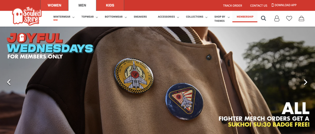
1. Hierarchical navigation
Hierarchical navigation is similar to a tree structure, organizing content into main categories that branch into subcategories. It’s like exploring a website step by step, moving from broad categories to specific details.
For instance, on an online clothing store, you start with “Men’s,” then navigate to subcategories like “T-Shirts,” “Jeans,” and “Shoes.” The best example here is The Souled Store.
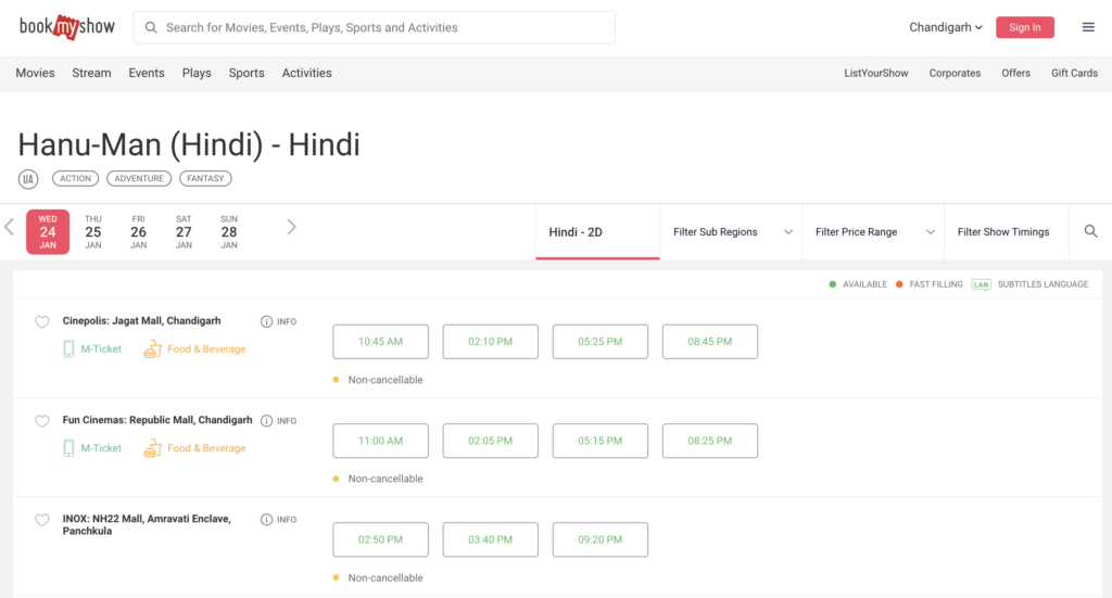
2. Sequential navigation
Sequential navigation is like following a recipe – a step-by-step journey to a specific outcome. It’s ideal for processes with a clear order, such as the checkout on an online store.
In an online booking system, you’d progress through steps like “Choose Date,” “Select Seats,” and “Payment,” ensuring a smooth and logical journey. You can have a look at Book My Show for sequential navigation.
3. Matrix or Hybrid navigation
Matrix or hybrid navigation is a blend of hierarchical and sequential styles. It’s like a combo meal, offering categories like a tree but with a sequence of steps within each.
For example, on a streaming service, you navigate through main categories like “Movies” and “TV Shows” (hierarchical), but within each, you follow steps like “Watch Trailer,” “Choose Quality,” and “Play” (sequential). The best example of this navigation type is Disney+Hotstar.

4. Structural navigation
Structural navigation is like building a house with a solid foundation. It organizes content based on the website’s structure, similar to rooms in a house.
On a news website, for instance, you navigate through sections like “Politics,” “Entertainment,” and “Sports” based on the logical structure of news categories. Newspaper publications like the Economic Times could be seen as a good example.

5. Associative navigation
Associative navigation is like connecting the dots to reveal a picture. It links related content, allowing you to jump easily from one topic to another.
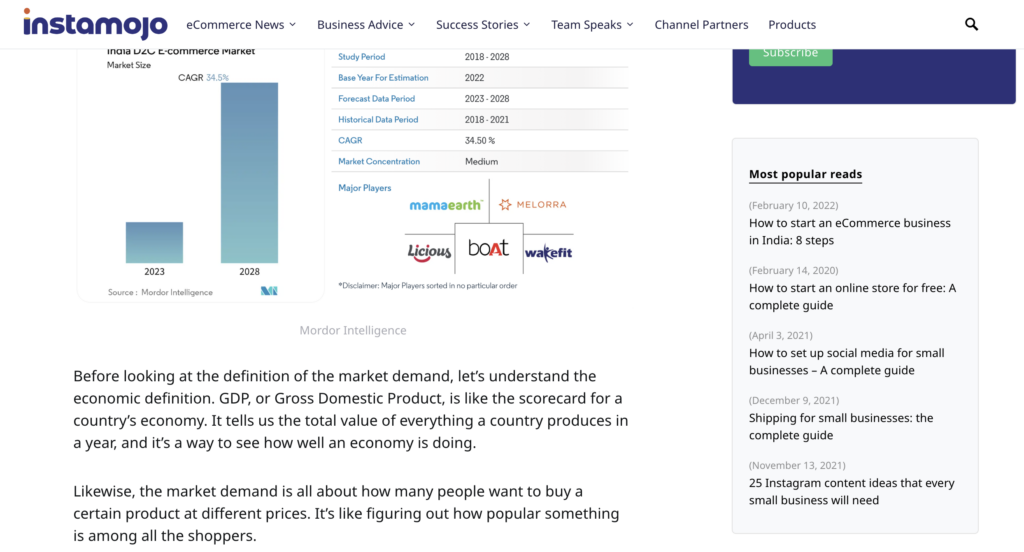
On a blog, for instance, reading about “Healthy Recipes” might lead you to related articles like “Fitness Tips” or “Nutrition Guides. Check out how Instamojo is doing it right.
6. Utility navigation
Utility navigation is your website toolbox, focusing on tools and features for effective use. It’s like quick access to a search bar, account settings, or a shopping cart.
On an eCommerce site, utility navigation includes essentials for a smooth shopping experience: shopping cart, account details, and a search bar.
Designing the perfect eCommerce menu
When creating your eCommerce website, you will have to decide how you want to categorise your products/services. Based on that, you’ll then create an ‘eCommerce menu’. This is the section of the website that shows the customer all your existing product categories in one go.
The more varied categories that you have, the easier it will be for your customer to reach a product they desire!
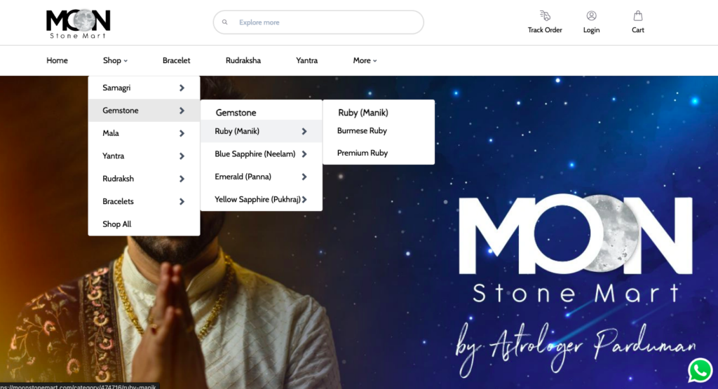
For example: Take a look at the Instamojo online store: Moonstone Mart
If you are on the hunt for a precious gem, this online store has made it easy for you to select your preference from the homepage itself. You don’t need to waste time “hunting” and can just follow the given map!
So how do you create the perfect eCommerce menu?
You need to balance aesthetics and functionality. Here are some steps to help you:
Logical hierarchy
Organize products logically for a clear and easy-to-follow menu structure. Use categories that make sense to your customers.
Intuitive labels
Keep menu labels simple and intuitive, avoiding confusing industry jargon. The goal is quick and easy identification for users.
Visual appeal
Enhance your menu’s visual appeal with high-quality images, engaging typography, and a consistent colour scheme that aligns with your brand.
Responsive design
Ensure your menu adapts seamlessly to various devices, providing a consistent and user-friendly experience on desktops, tablets, and smartphones.
Search functionality
Implement a powerful search function within the menu for quick product searches. Auto-suggestions and filters can enhance the efficiency of the search process.
Highlight special offers
Feature ongoing promotions or special offers directly in the menu to entice users to explore and take advantage of discounts.
Dropdowns and mega menus
Use dropdowns or mega menus for extensive product ranges, maintaining a user-friendly experience without overwhelming visitors.
eCommerce navigation best practices
Except for the eCommerce menu, there are multiple other things that you can do that will make it easier for your customer! The idea is to make it enjoyable for them to browse your products.
Here are some best practices that you should follow when creating an eCommerce website:
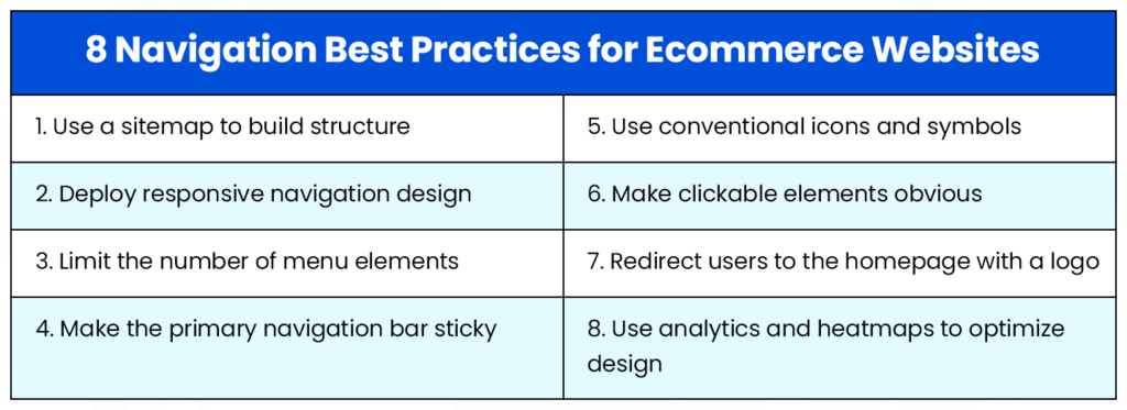
Let’s walk you through some of these:
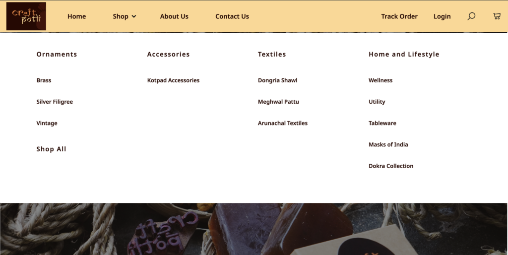
1. Clear and concise categories
Use straightforward language to guide shoppers easily to what they want with well-labelled, clear categories. Check out how Craftpotli, an Instamojo store is presenting the different categories of the products.
2. User-friendly search bar
Provide a breeze-like search experience with an easy-to-use bar, featuring auto-suggestions for quick navigation.
Also, make sure they are sticky i.e. they are in the same place even if you go to other pages. The customer should always have easy access to the search bar!
3. Responsive and intuitive filters
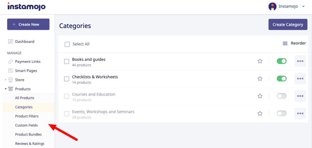
Act like a personal shopper by allowing users to customize their search with intuitive filters based on price, brand, and size. See how Instamojo allows business owners to present product filters to their customers.
Store in focus: Thrust Factor
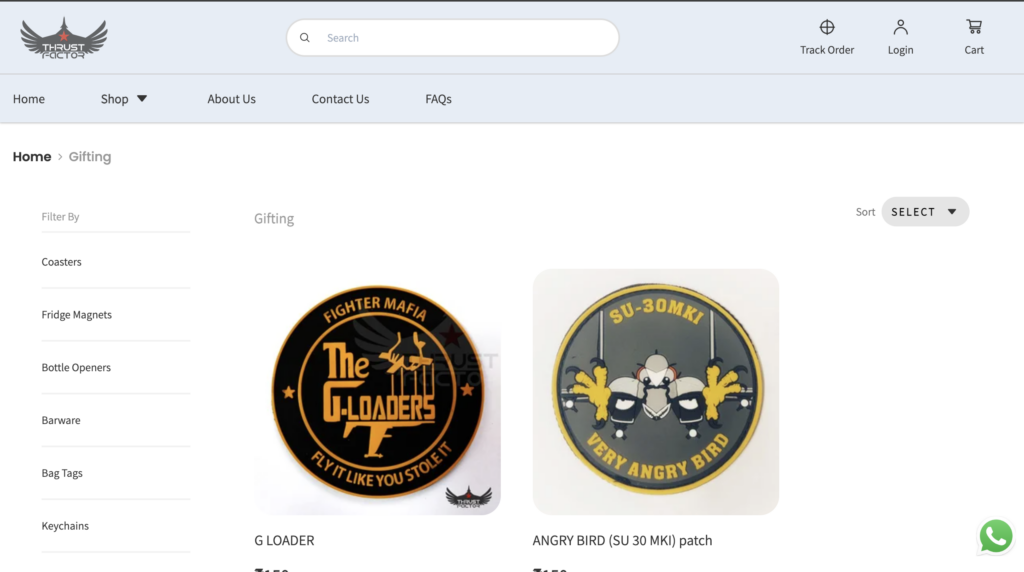
Tip: Enhance user experience with simple and relevant filters that don’t complicate navigation.
4. Mobile-friendly design
Ensure easy tapping and adaptability to different screens, providing a pocket-sized shopping experience as enjoyable as on a desktop.
Tip: Ensure cross-platform smoothness by testing on diverse devices.
5. Featured products and recommendations
Curate an online store tour by highlighting best sellers and recommendations, offering customers a must-see display.
For a better visual of this practice see how the Instamojo online store – Sajja has shown its featured products on the homepage. This reduces the decision-making time for your customers as they can quickly see what products are the best in your store!
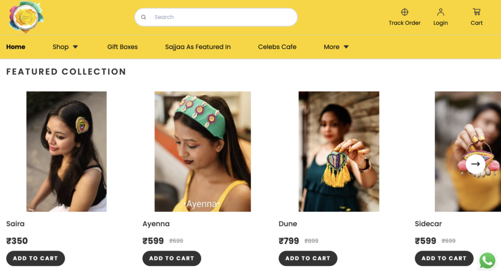
Tip: Use algorithms to personalize recommendations based on user browsing and purchase history.
6. Streamlined checkout process
Ensure a smooth, express checkout process with clear steps, visible progress, and the option for hassle-free guest checkout.
Tip: Cater to quick and hassle-free experiences by offering a guest checkout option. Now with our latest feature “Address Autofill” customers using the Instamojo payment gateway can cut down on their checkout process time!
7. A/B testing for continuous improvement
Keep things fresh by experimenting with layouts or button placements through A/B testing, creating a better, more user-friendly version of your digital shop.
Tip: Monitor analytics and user feedback for informed adjustments.
Don’t miss this out:
Top Design Firms states that 38% of initial website visitors prioritize the layout and navigation links. A confusing layout or hard-to-find navigation may lead to visitor departure.
What are the main pages that every Online Store should have?
Building an online store is like creating a digital haven for shoppers.
Here are 10 pages that form the foundation of a successful eCommerce website:
- Homepage
- Product pages
- Shopping cart
- Checkout
- About us
- Contact us
- Privacy Policy and Terms of Service
- Return and refund policy
- FAQ (Frequently Asked Questions)
- Blog/content page
1. Homepage
Your digital storefront—a welcoming, visually appealing introduction. Make it easy to navigate, showcasing featured products.
(Use Instamojo builder to customise the layout of your homepage as you wish)
2. Product pages
Offer detailed information, high-quality images, pricing, and a clear call-to-action. Prioritize a user-friendly layout.
3. Shopping cart
Where customers review and manage items before purchase. Ensure a clear display and seamless transition to payment.
4. Checkout page
Streamline checkout with minimal form fields, multiple payment options, and guest checkout for convenience.
5. About us
Introduce your team, share your mission, and highlight what sets your store apart. Build a personal connection for trust. Here is a guide!
6. Contact us
Provide various ways for customers to reach out. This instils confidence by showing readily available customer support
7. Privacy policy and Terms of service
Pages outlining policies to build trust and ensure legal compliance.
8. Return and refund policy
Communicate policies clearly, detailing timelines, conditions, and procedures for confidence, especially for first-time buyers.
9. FAQ (Frequently Asked Questions)
Anticipate queries with a comprehensive FAQ page. Address common concerns about shipping, returns, and products.
10. Blog/content page
Position your store as an authority. Share valuable information, trends, and product highlights, enhancing your site’s SEO.
Give your customer the best experience with Instamojo
Want to create an eCommerce website? Start with Instamojo.
Instamojo websites come readymade with the essential pages mentioned earlier. You can easily modify the pages and add what you want to.
You can also create product filters and category pages to help your customers make more purchases from you.
Don’t believe us? Sign up and create an online store for free!